
Vilfredo Pareto was an economist who, among major accomplishments, identified that 80% of Italian wealth was held by only 20% of the population. The distribution is even more skewed today than in his time.
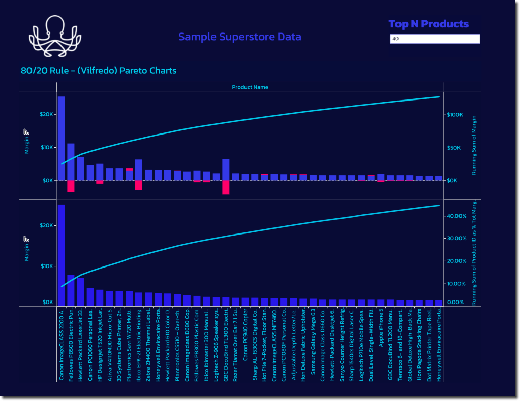
Weirdly, most people don’t associate Pareto with income inequaility, but instead with Whale or Pareto Charts. These charts show a cumulative total or percentage and often have a second data series plotted to show individual contribution simultaneously.

They are useful for all sorts of analysis including evaluating product portfolios and customers contributions to revenue and margin. You can very often find an inflection point in the distribution after which only very small incremental contributions occur — this is the begining of the long tail.
Sometimes you hear this described as the 80/20 rule or the 90/10 rule, where just 10% of a companies SKUs account for 90% of their total revenue. The associated carrying cost of all the inventory and logistics of the infrequently purchased items can make them negative margin when all costs have been accounted for.
You can be easily build Pareto charts in Tableau using the quick table calculations and aligning measures to a dual axis. Another tip is to apply a top N filter parameter so the user can choose what portion of the full data set to display. You can also color code the results to show the inflection point you want to display or create sets for additional analysis in other views where you want to segment based on the threshold you visually identify from the chart.
The Sample Super Store default data in Tableau didn’t illustrate this as nicely as I had hoped, but hopefully you get the point.

Leave a comment