
Its easy to use!
I’m not certain who came up with the waterfall visualization (maybe BCG?), a variation on a standard bar chart, but they are super common in pricing analysis.
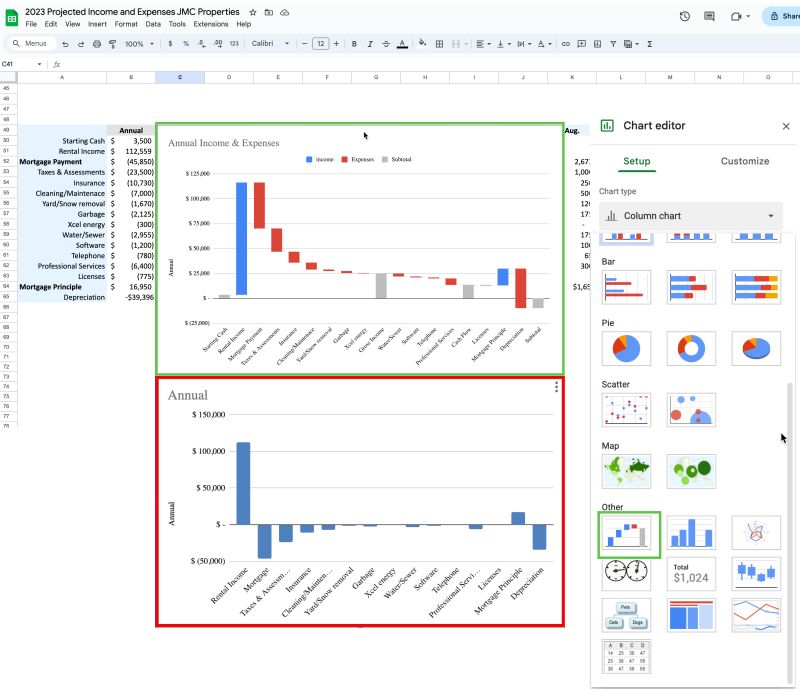
They are an improvement on other bar charts because they show debits sequentially and then allow the user to see intermediate price points which may have particular meanings, like Target Price and Pocket Margin.
Years ago it was a huge pain to produce these charts in Excel and I had a template from a colleague that I usually started with for requirements gathering sessions and carefully modified so I didn’t mess up the floating bars or formulas.
This graphic still isn’t a standard viz type in PBI or Tableau, but you can easily make them in Excel and Google Sheets.
To make a good, drill-able chart you still need to do a lot of data prep for allocations and proper sequencing of the adjustment values between price points, but actually creating the chart has become a few minute exercise.
The image is an example from my rental properties which provides the functionality of a pie chart — showing the relative contribution of multiple categories to a whole, but also enable the visualization of negative and positive values together.
You’d probably have to create a data table to go along with the Sheets chart to see all the price realization percentage calculations and supplementary information for the chart, but kudos to Google on incorporating this viz type with a really solid UX for creating and sequencing the subtotals columns.

Leave a comment